LP1 Web Trend Report Emerging Trends
2020 is an interesting year for a multitude of reasons, and many are looking forward to new beginnings in the next year. That means the beginning of new trends in the web development field that will define the look of websites for the next decade. Here are 5 of the more popular trends of this year more closely examined and ranked.
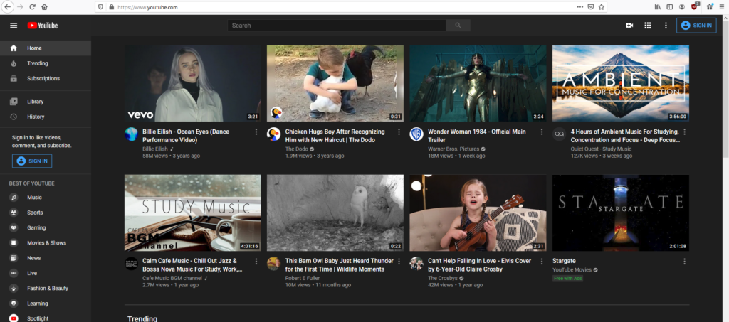
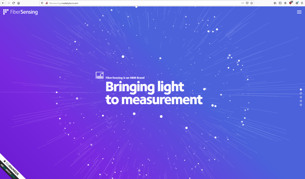
Dark Mode
Dark Mode is proving to be a popular movement among frequent users of the internet and technology. Once only an OS-wide aesthetic choice, now the mode has extended itself to popular websites, allowing the choice to remain saved in a user’s preferences or cookies for return visits.
Will the trend become a standard?
I don’t believe the trend will become a standard, but instead will evolve further into a customization mode to allow the colors to extend beyond “dark mode” and be able to set any kind of colors for the elements–link text, paragraph text, background color, etc.– and allow the web to become more accessible as a byproduct (e.g. those with disabilities that may want text that contrasts or emboldens itself against the background color).
Personal Rating: 5/5
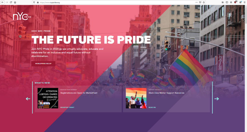
Gradients
Since Apple’s iconic shift away from Skeuomorphism in iOS 6, Gradients have become a design trend in not just application icons, but the entire application experience. When multiple colors are combined, or the illusion of depth between elements is added, it gives the user more physical cues towards where to interact on the website.
Will the trend become a standard?
The trend, for the most part, already has. Though, the ideal is to go beyond two colors and explore multi-color gradients, a la the Instagram logo or the poster for the 2020 film Tesla. Changing colors for the gradients dynamically is also an option. The key is knowing when it is appropriate to use a Gradient and when to not; what elements do you always want to be at the forefront of the user’s experience? A Nav Bar should remain a stark, flat color when put against a gradient background.
Personal Rating: 4/5
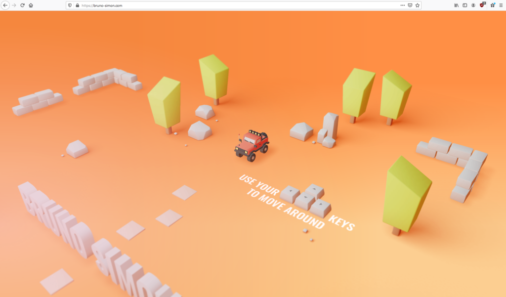
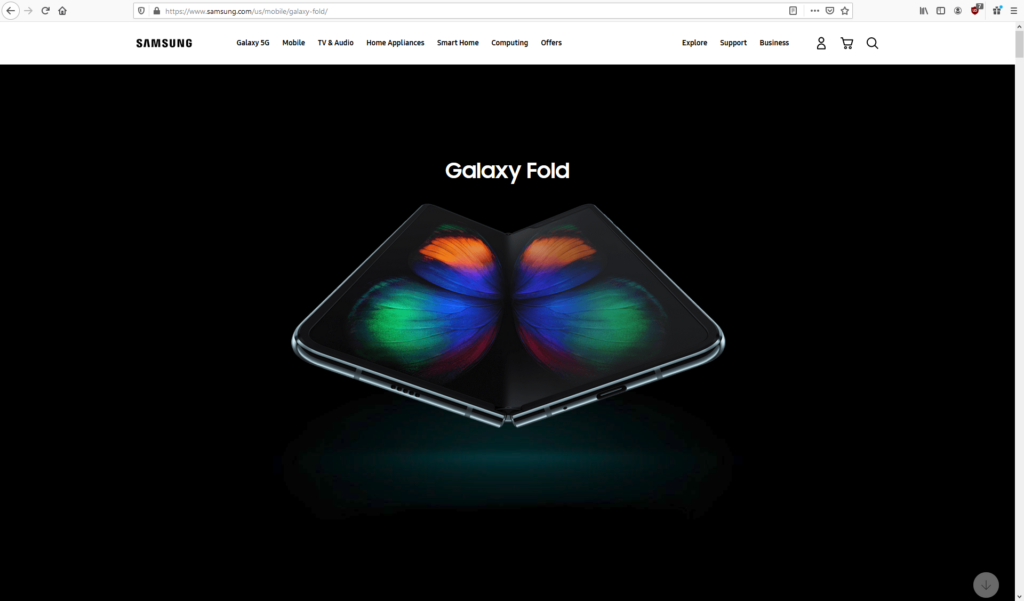
3D Elements
Bursting from the Z-axis, the Third Dimension promises to “wow” visitors with flashy animations, games, and graphical effects to make your website stand out. You can present products in real-time, showcasing things like dimensions, customization options, and guided tours through the product’s features. The effects can turn out realistic and practical, or charmingly cartoonish.
Will the trend become a standard?
Those fortunate enough to have decent internet speeds at home and on the go would be lead to believe that, yes, this should become a standard. But for a large majority of people that live in rural areas, have poor choices between ISPs, can’t afford better data plans, or don’t have a good cellular service provider wouldn’t be able to see what they’re missing out on. Used sparingly this can create a stunning effect on a product showcase, but be considerate of the user’s hardware and software limits.
Personal Rating: 3/5
Typography
Clean, legible typography is important not only for aesthetic purposes, but for accessibility purposes as well. To make a font more pronounced by emboldening, adding a drop shadow, using all-caps, or outlining may provide an eye catching front page in an instant.
Will the trend become a standard?
The trend should become a standard, but I can imagine cost being a major prohibiting factor in terms of businesses wanting to license popular fonts for commercial use. Font creation is an option, but development of a font that’s both memorable and legible could cost even more. To add, consistency across devices is necessary to maintain the intended impact.
Personal Rating: 3/5
White Space/Negative Space
Whitespace (or negative space) is what it sounds like: blank space. The blank space is intentional and used to separate elements to create balance or distinction between elements. It can appear to provide the illusion of “floating” to objects like transparent PNGs. It can also prove itself useful by increasing legibility due to the increased space real-estate.
Will the trend become a standard?
The issue I have with this trend becoming a standard is because a majority of my web browsing is performed on widescreen displays in order to have more screen real-estate and absorb more content. Creating more negative space on top of the space that is already there from the “mobile-forward” web design just hinders the browsing experience on desktop even further.
Personal Rating: 2/5
Resources:
- https://designmodo.com/gradients/
- https://dzone.com/articles/3d-unique-website-designs
- https://designmodo.com/typography-front-pages/
- https://www.wix.com/blog/2019/11/web-design-trends-2020/
- https://designmodo.com/web-design-trends-2020/
- https://www.popwebdesign.net/popart_blog/en/2020/02/top-11-web-design-trends-to-rule-in-2020/
- https://www.pexels.com/photo/green-leafy-plant-starting-to-grow-on-beige-racks-127713/